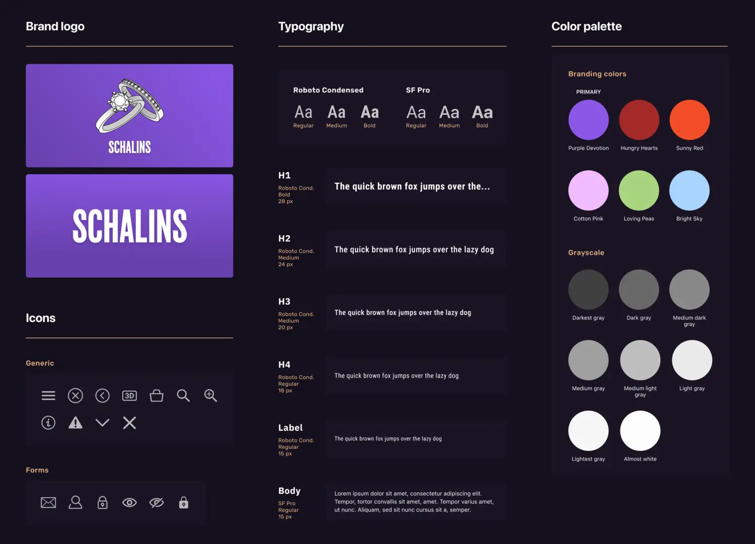
RingTailor
During my internship as part of my UX design education, I worked on the latest version of Schalins Ringar's ring design app.
My job was to apply better usability and a more modern look to the app, as well as the company's new branding guidelines, without making too many changes to the structure.
Project Details
Project Type
- ●IPad App Design
- ●Team Project
- ●Internship
6 months (2021-2022)
Tools
- Figma
- Adobe Photoshop
- Adobe Illustrator
- Trello
- Discord
Role & Responsibilities
UX/UI Designer
The design team consisted of me, two other interns, and the product owner. I was primarily responsible for setting the general design guidelines, creating the main components, and structuring the instructions for the developers.
Target Groups
Retail staff and shop owners in the jewelry sector, ranging from those new to the job to experienced professionals.
The Problem
The Challenge
The Solution
Solution Overview
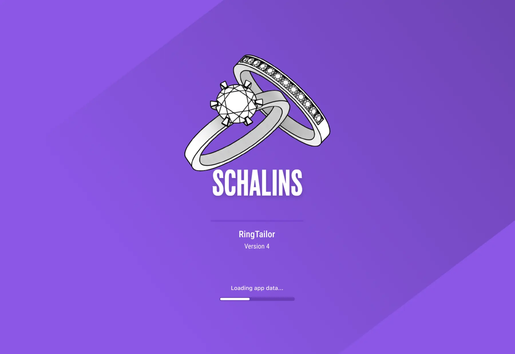
Loading


Key Learnings
- Communicating efficiently and clearly with developers.
- Compromising on design choices and argue for opinions and points of view.
- Designing within technical constraints and learning to understand the possibilities and limitations of the development platform (Unity).
- Explaining and advocating the importance of accessibility to senior management.
- Creating and managing a component library / basic design system.
- Interpreting and evaluating other designers' research and insights and using them to inform my design decisions.
Research
Analyzing Branding Guidelines
One of my first challenges was to interpret and analyze the new design guidelines. Made for print and lacking contrast, they weren’t suitable for an app, so I needed to find alternatives. I tested and analyzed fonts, colors, contrast levels, etc.
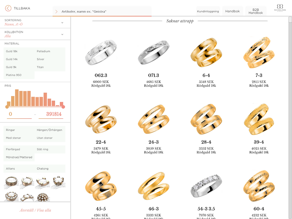
Evaluating Previous Design
In reviewing the previous design, I found several usability issues. Text and buttons were in most cases far too small. I found it very difficult to read some texts and to find the right buttons.
Another consistent shortcoming was problems with heading hierarchy and general structure. As a user, I often had to scan all the text to understand what was what. It was also often awkward to use sliders and other functions, either because they were too sensitive or because I didn't understand what they did.
Reviewing Previous Research
Our team was also able to access the research and insights from the previous two iterations of the app, which were made by other UX designers. These insights guided our design decisions and helped us understand the users' needs and pain points better.
We reviewed various materials, including: UX review, customer journey map, impact map, and interview insights.
The insights I took away from studying and analyzing the work of other UX designers helped me get into the project more easily. Building on someone else's research was not something I had done before, so it was a great learning experience!
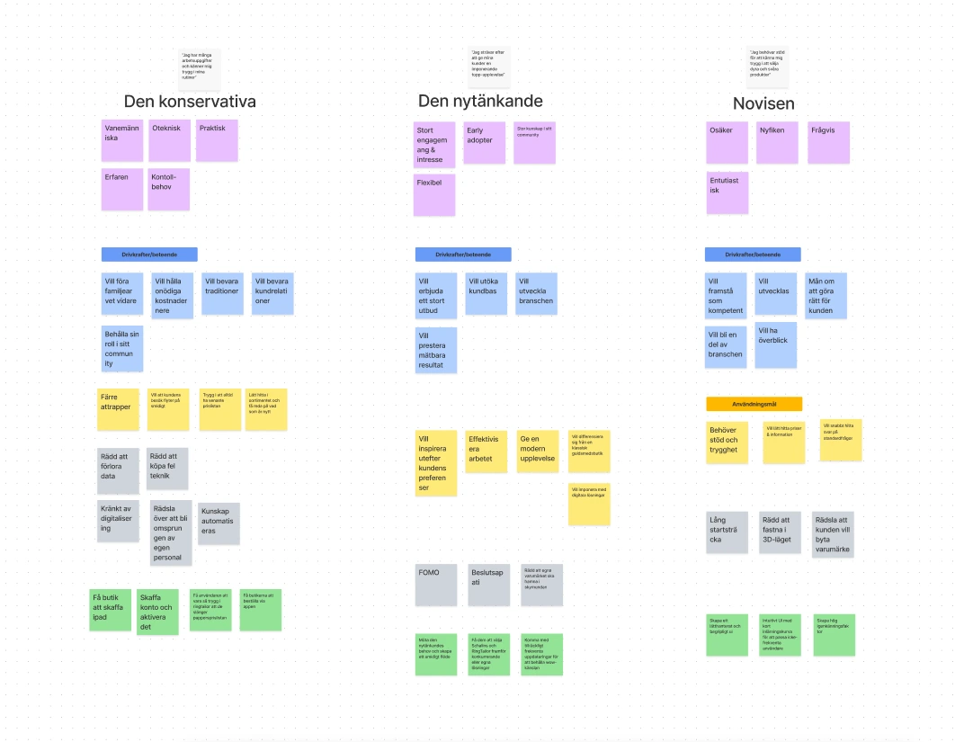
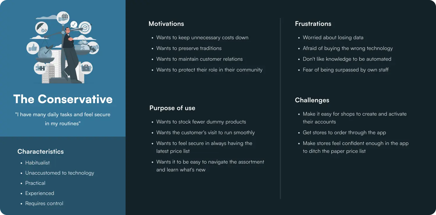
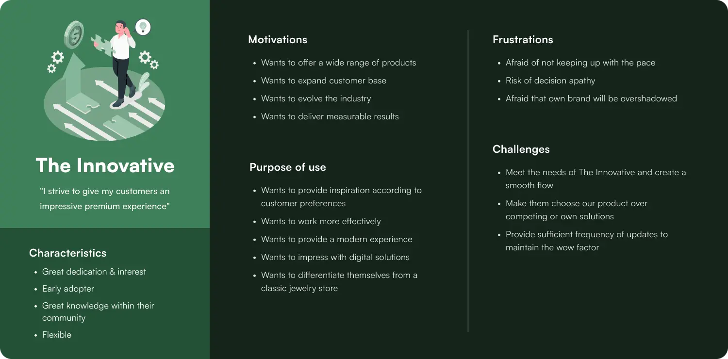
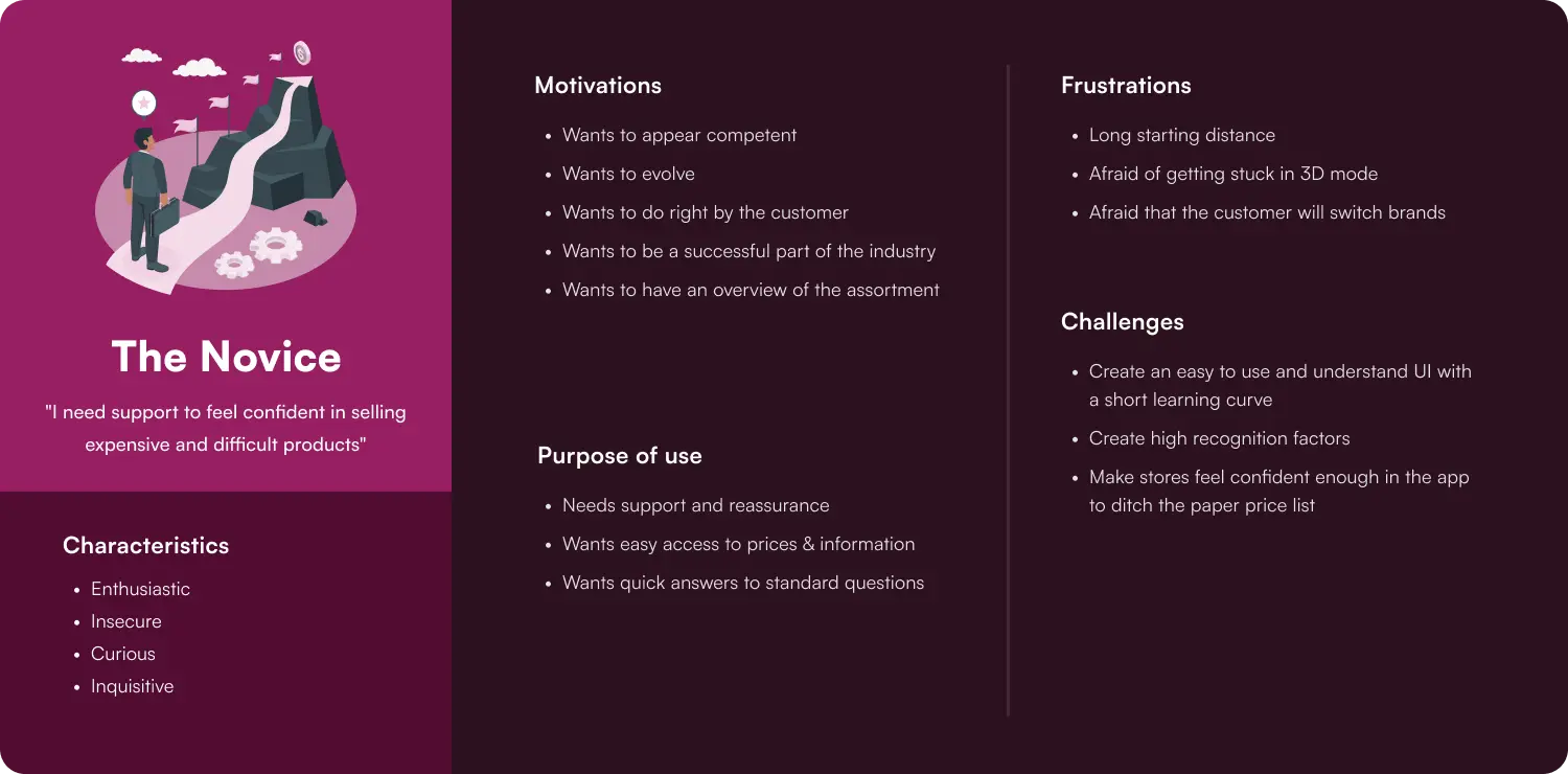
Developing User Archetypes
Based on the previously gathered material and the product owner's own knowledge, my team developed three user archetypes. These made it easier for me personally to always keep the user in focus during my work.
The main purpose of developing archetypes was to make it easier for us as a team to work towards the same goal and make sure to satisfy the user's needs, even though we were working on different parts of the app.
Design Review
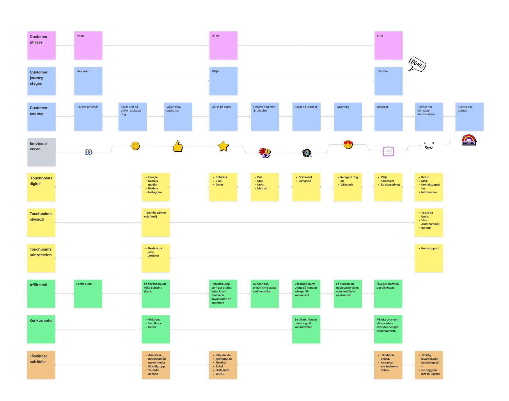
Customer Journey Map
User Archetypes - Affinity Map
User Archetypes
Key Insights from Research
Improved Product Filtration
The customer journey map made it clear that there was a dip in the user experience when filtering in the app. A new UI is needed for this that makes the process clearer and more transparent.
More User-Friendly UI
The design review and impact map revealed that the previous design had several usability issues, such as small text and buttons, and a lack of visual hierarchy. The new design needs to address these issues to create a more intuitive and user-friendly experience.
Ideation
Sketches and Wireframes
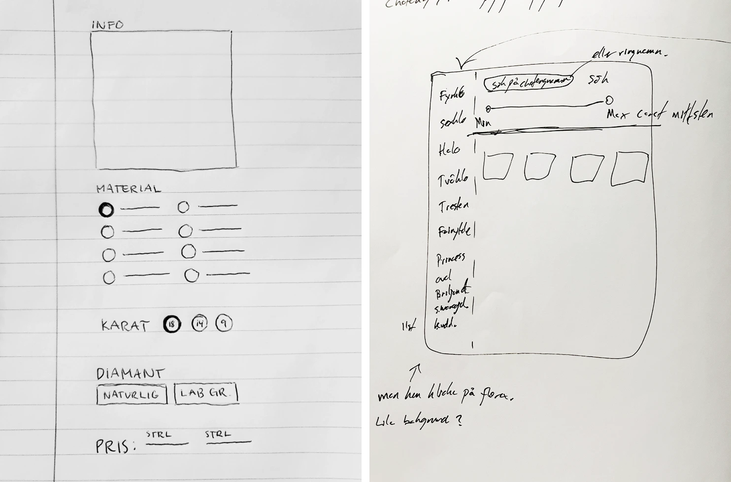
Early in the project, I created sketches and wireframes for the main screens and components of the app, which I used to communicate my ideas to the team and get feedback. Sketching was also a valuable tool for the product owner to communicate his ideas to me, especially in areas where my understanding was limited.
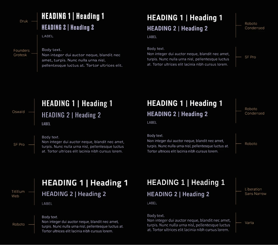
New Typography Guidelines
To meet the requirements of digital solutions, I had to create a new set of fonts since the ones acquired with the new branding were not suitable. Being a font nerd, this became an enjoyable project for me!
To preserve the desired brand feel, I selected options that closely resembled the originals. Additionally, I explored fonts within the same visual category. As a team, we finalized our choice and settled on a favorite set (Roboto Condensed and SF Pro).
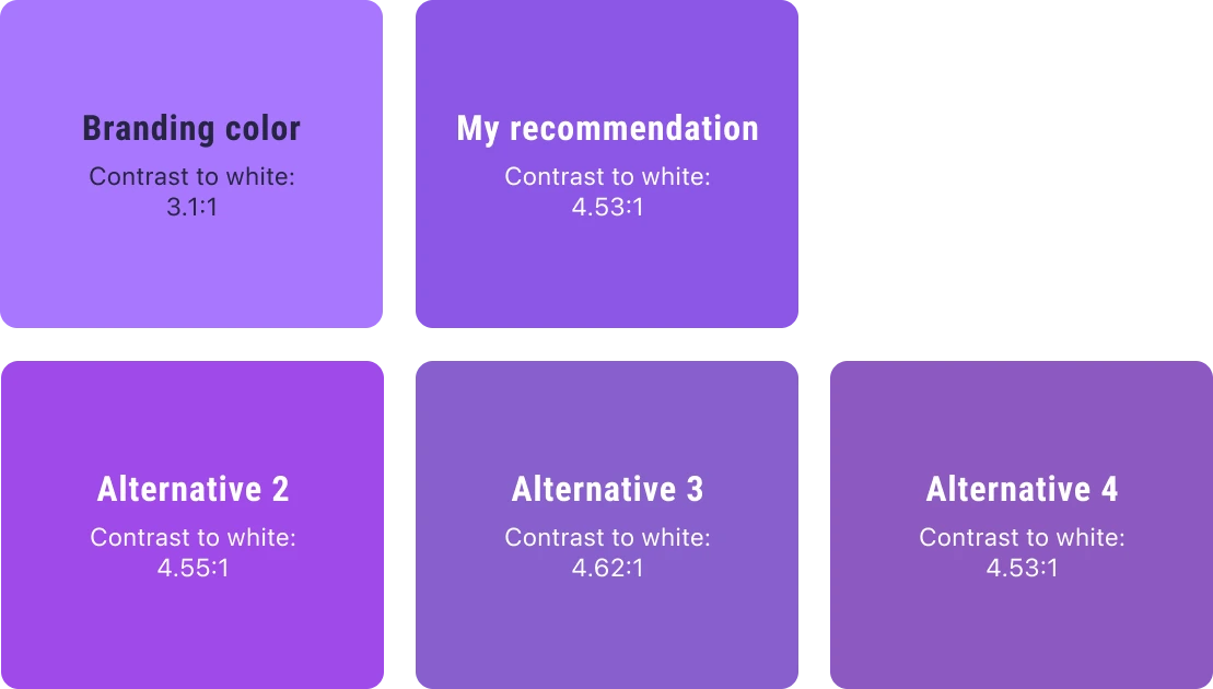
Brand Color Palette Adjustments
During my evaluation of the company's new branding, I noticed that the new primary color lacked sufficient contrast against white text, which the company wanted for digital content. I generated several contrast-approved alternatives to the primary color in hopes of finding a suitable solution.
After reviewing my suggestions and hearing my reasoning, the company went with my recommendation to ensure accessibility while keeping white text on their primary color.
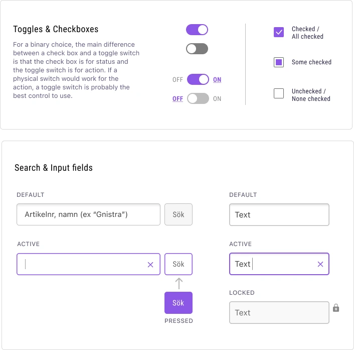
Building a Component Library
To ensure consistency across the app and make it easier for designers and developers to implement the design, I created a component library early in the project, expanding it as needed and adding written guidelines for consistent usage. References included Apple’s Human Interface Guidelines and WCAG 2.1.
Since the app was built in Unity, where UI is often image-based, I ensured correct structure and layer order for all assets.
Standardizing buttons was a particular challenge due to a limited color palette, multiple states and variants. After team discussions and feedback from the product owner, we landed on a consistent system used throughout the app.
Color Suggestions
Typography Exploration
Sketches
Wireframes
Style Guide
Component Library
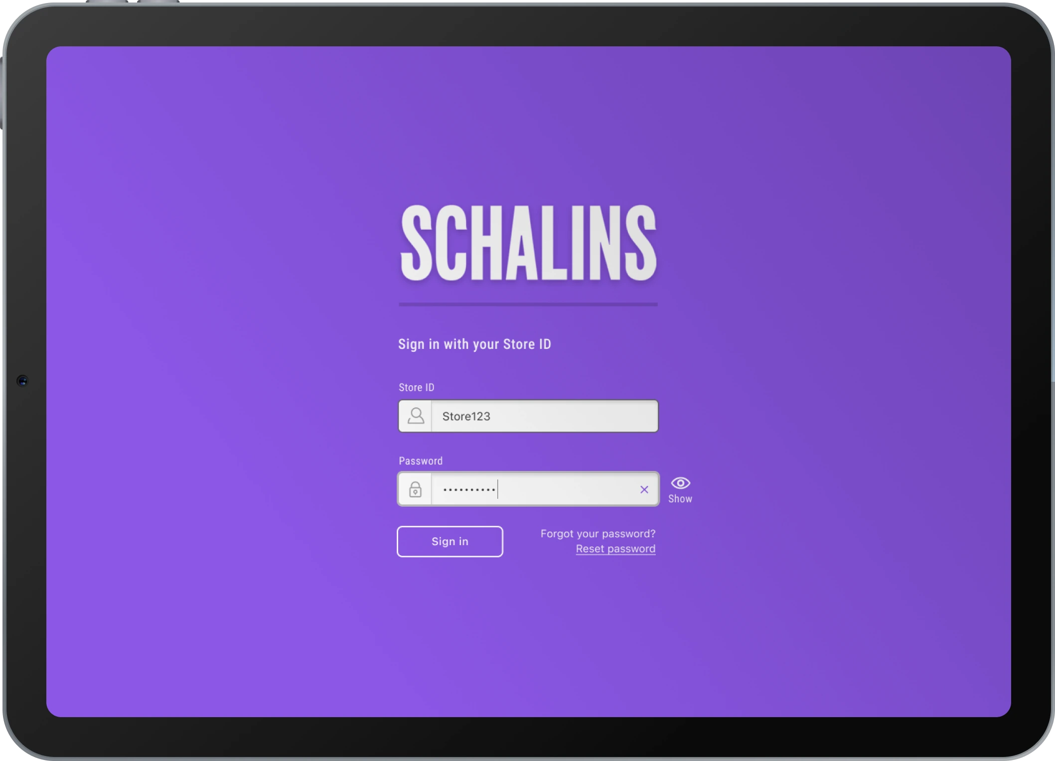
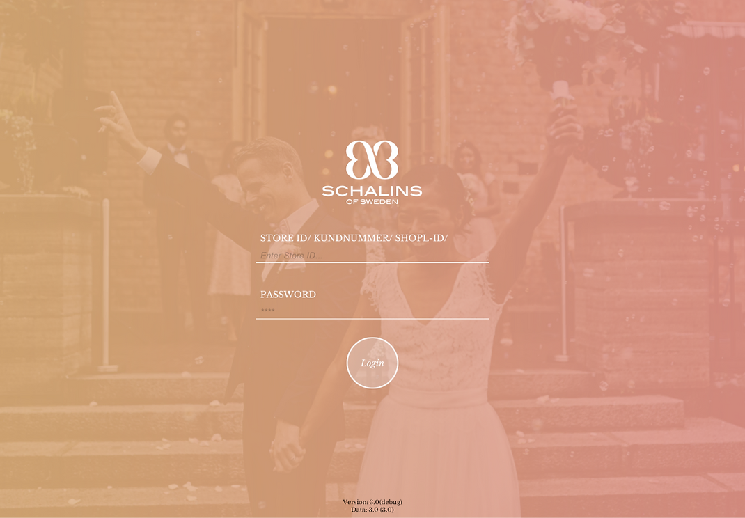
Sign In
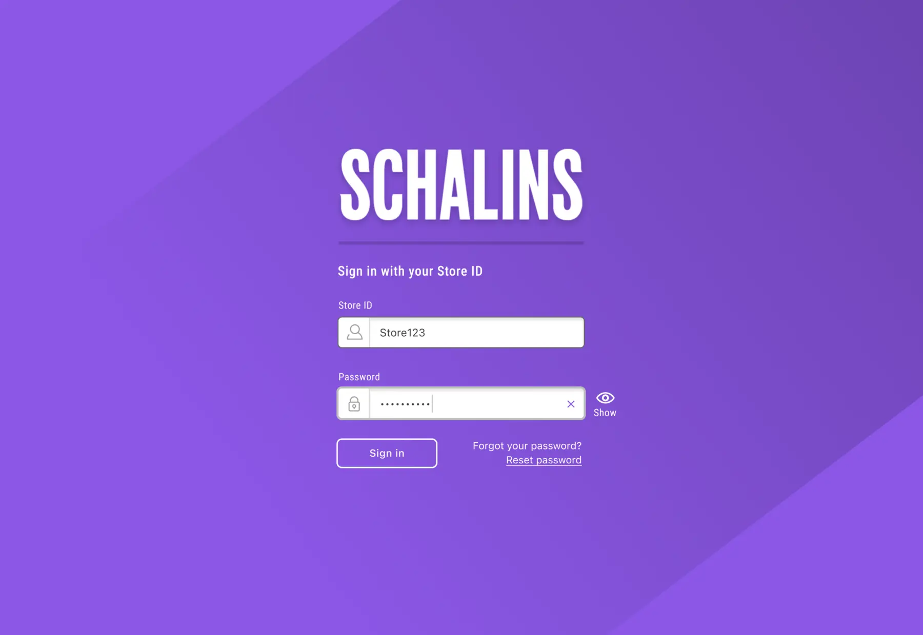
The Problem
Issues with contrast and readability. Small and poorly visible input fields made it hard to interact with them, as they were difficult to tap and the text within was not easily discernible.
The Solution
Larger input fields and buttons and enhanced contrast. Functions added for password display and reset, giving users more control and a smoother experience.
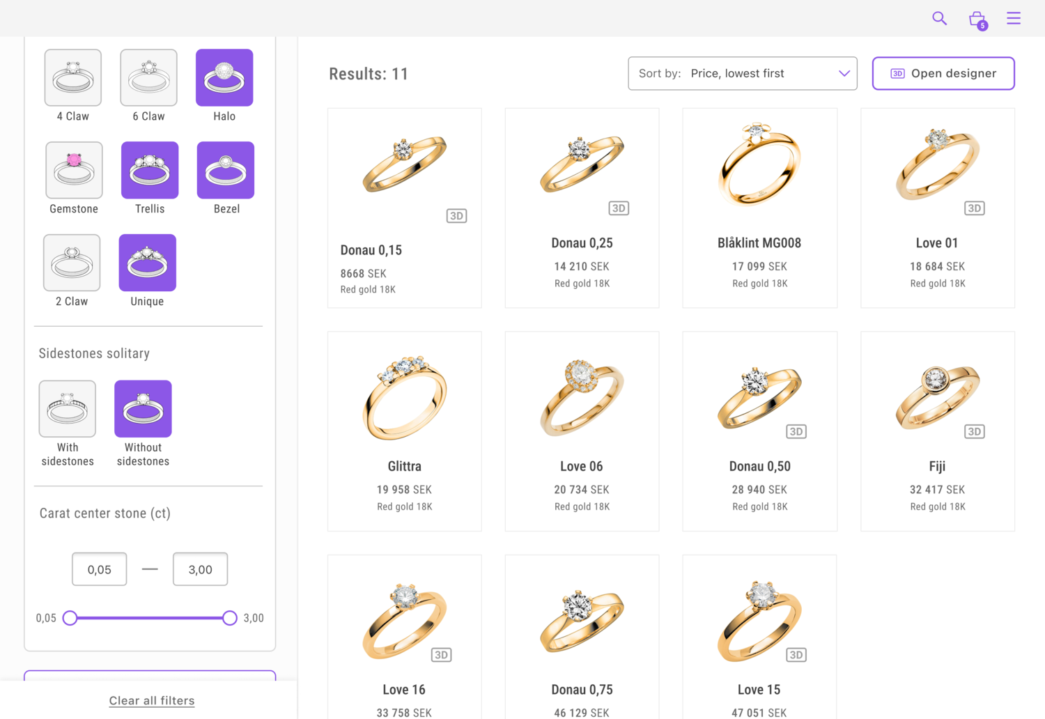
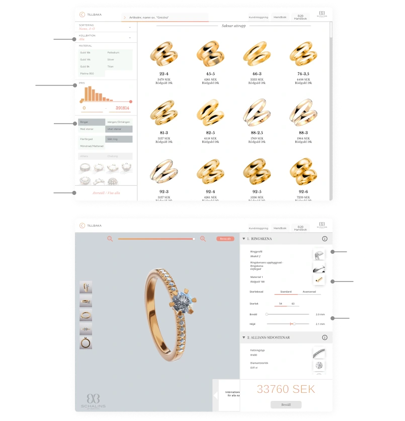
Browse & Filter Products
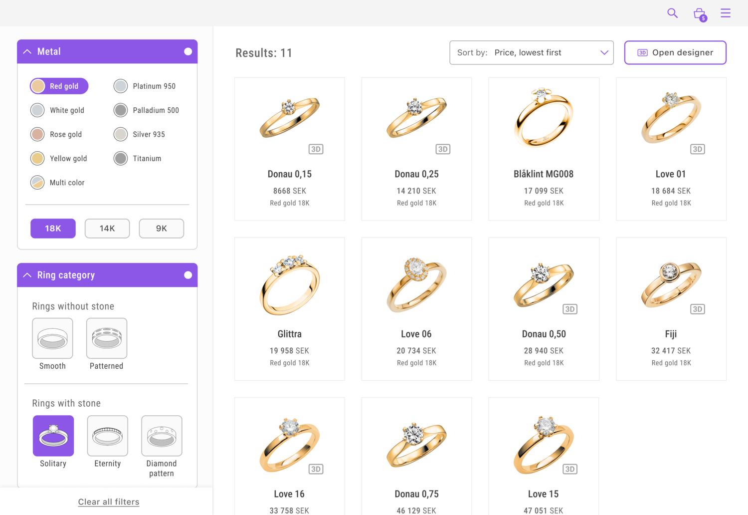
The Problem
Contrast issues, unreadable text, and unclear formulations. The results also lacked clarity on rings available for 3D modification, a central function of the app.
The Solution
Clearer visual feedback and enlarged hit surfaces for buttons and clickable elements. A more defined hierarchy improved category understanding and filtering visibility. Enhanced result structure, with icons indicating rings that can be modified in 3D designer mode.
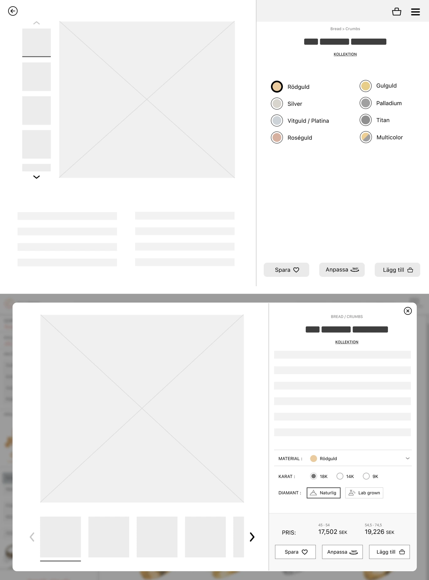
View Product
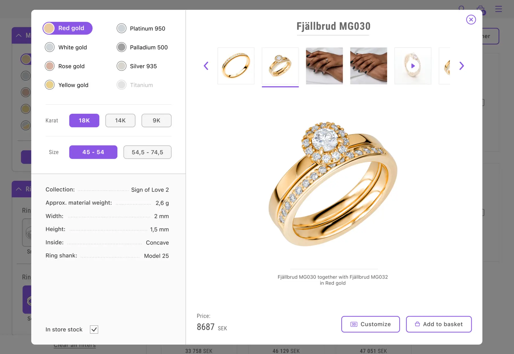
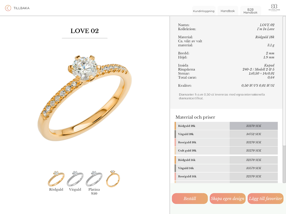
The Problem
Unclear interactions to select metal color and carat, and it prioritized data over actual choices, which customers are usually most interested in.
The Solution
Enhanced visual feedback on the choices made, with a focus on customer choices rather than data for store staff. The image gallery is now more prominent. The "Add to favorites" function was removed since it wasn't used.
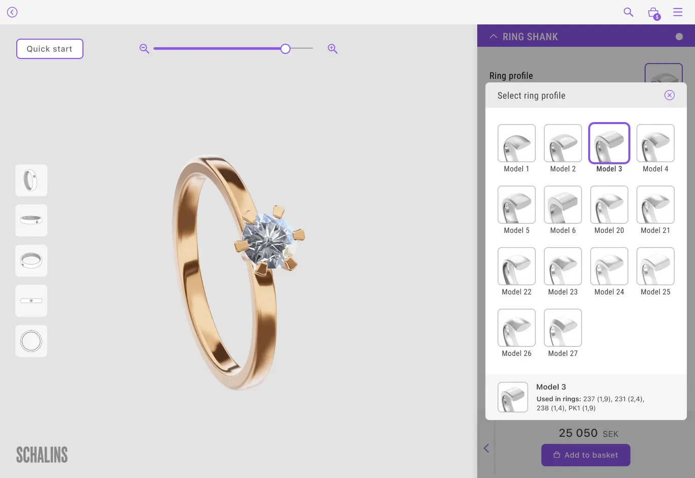
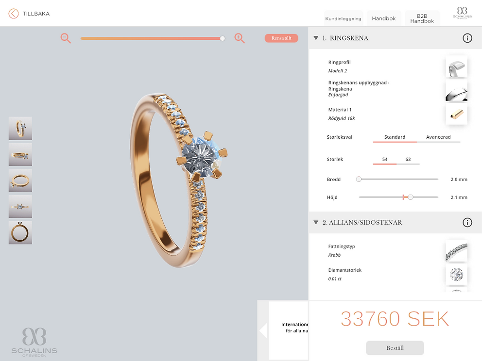
Ring Designer (3D)
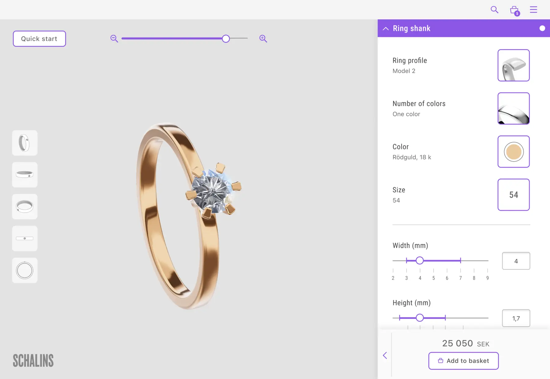
The Problem
Unclear text hierarchy and industry-specific language, resulting in user comprehension difficulties. Inconsistent pop-up window designs worsened usability issues. Sliders caused usability hurdles, impeding user interactions.
The Solution
Enhanced visual clarity for user choices and appearances. Simplified language and standardized all pop-ups with consistent pattern and grid layout. Improved sliders with incremental scale values and input fields for fine-tuning.
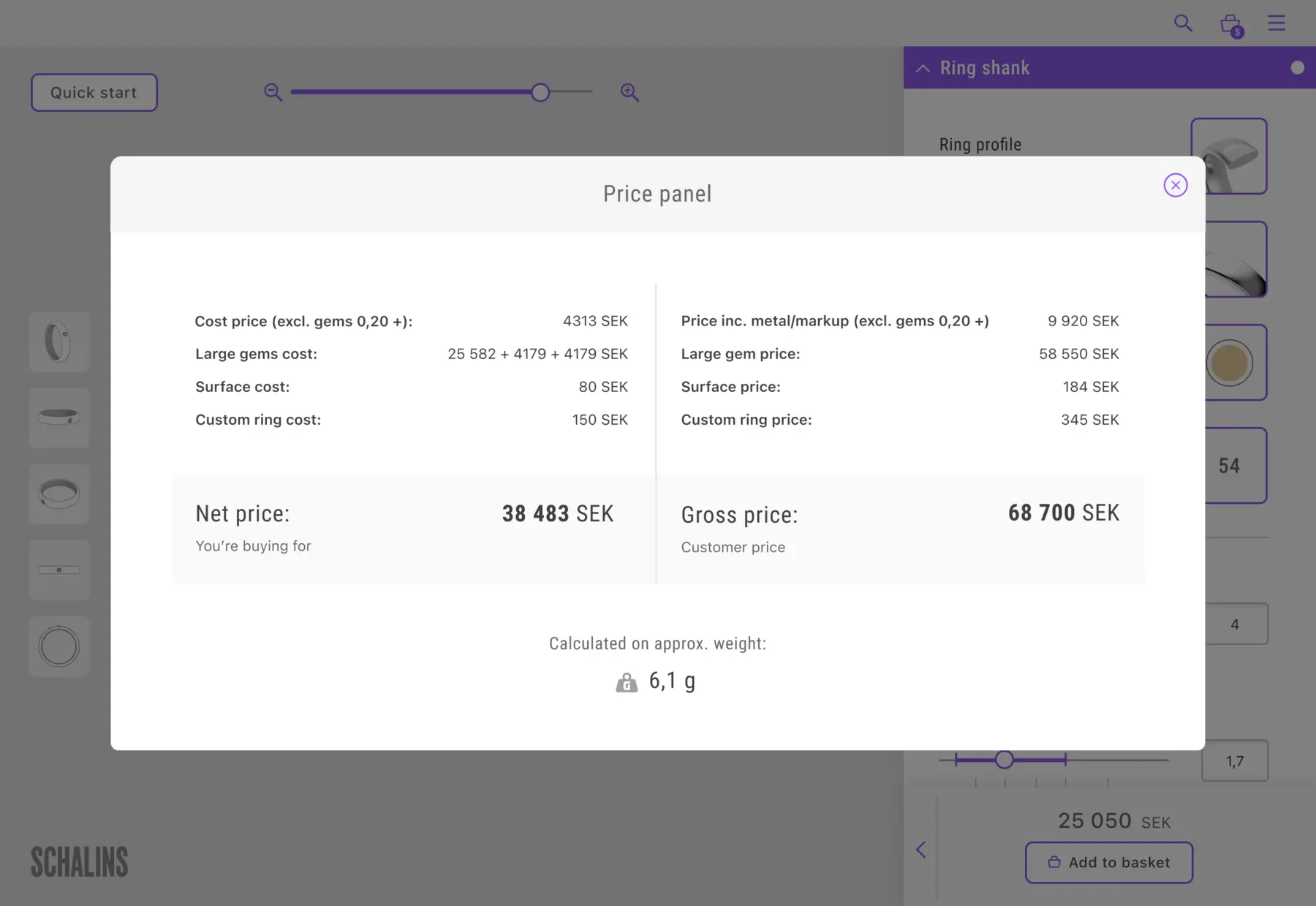
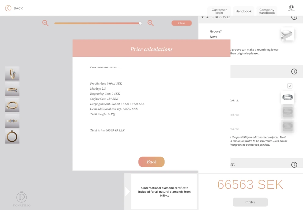
Price Panel

The Problem
Small text that was hard to read. Unclear calculations that were hard to understand. Many users didn't understand how the price was calculated and what factors influenced it.
The Solution
Clearer separation of price and profit, improved structure through headings, and a breakdown of the final price components for better transparency. The price panel was also made more visually appealing and easier to read.
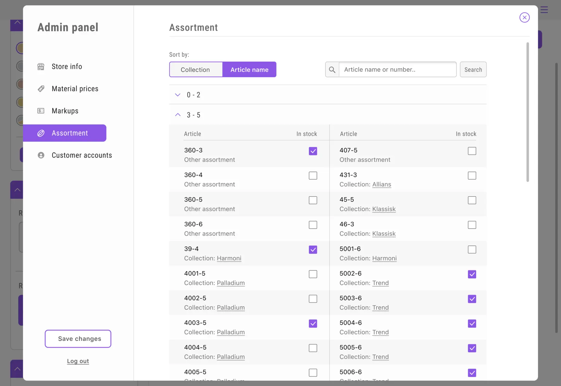
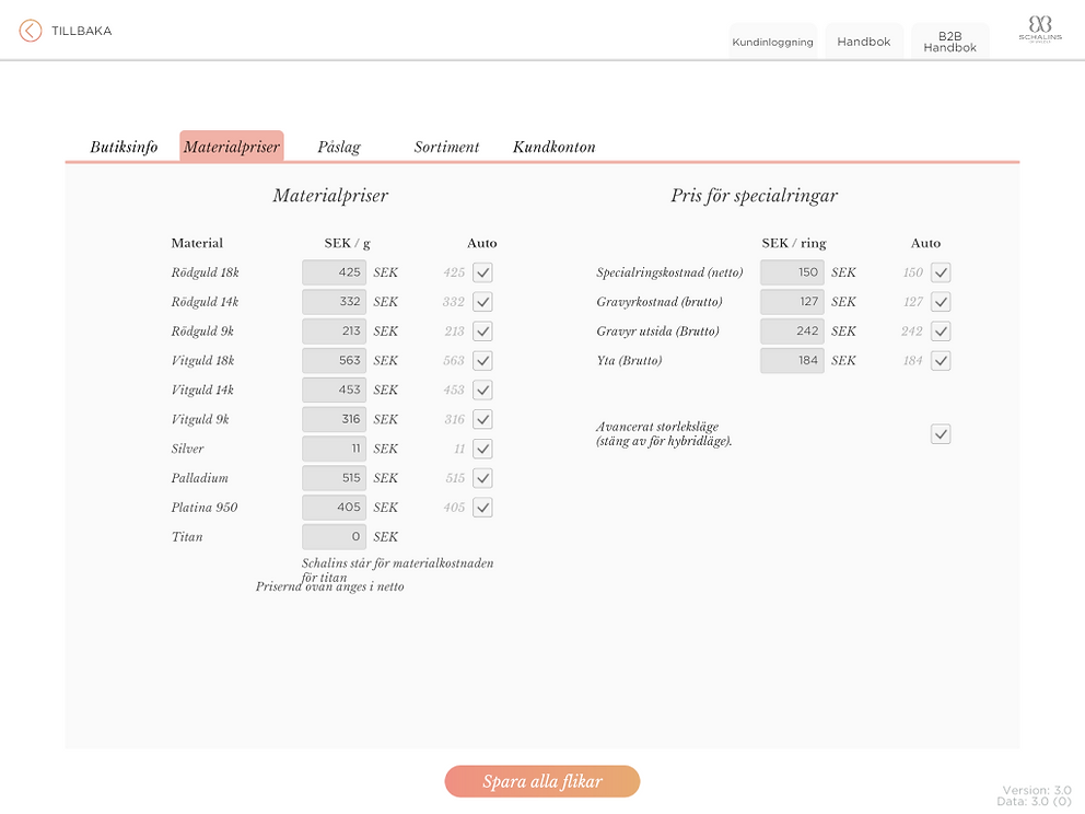
Admin Panel
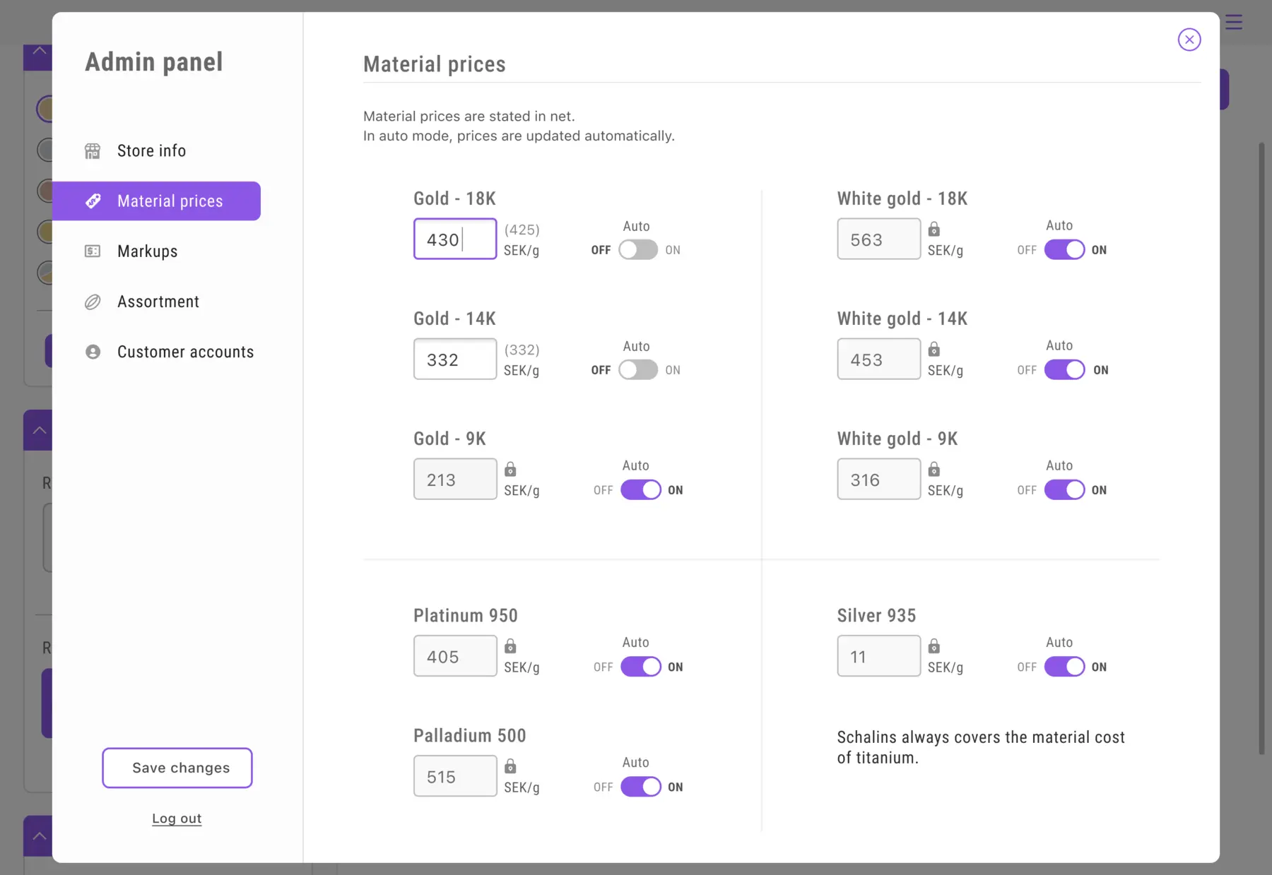
The Problem
Small input fields were challenging to hit accurately, while low contrast and cursive text in several places made the text difficult to read. Additionally, the lack of a clear structure and information added to the usability issues.
The Solution
Input fields show clear states (shadow when unlocked, colored frame when active, padlock when locked). Modified price fields display values to the right. Checkboxes became toggles for better usability, and fonts were enlarged for improved readability.
Reflections
Collaborating closely with developers throughout the project was both challenging and incredibly rewarding. Being involved from start to finish gave me a deeper understanding of how design decisions evolve in a live setting. I’m proud of the results we delivered, but with more time, I would have liked to conduct thorough user testing and research.
If I had continued working on the project, my main focus would have been on validating our design choices through user feedback. Ensuring that a solution meet real needs and expectations is something I always strive for.
It was also an important lesson in how, as a UX designer, you sometimes need to advocate for key steps in the process, and that it’s important to stand by your convictions. That’s something I’ll carry with me into future projects.
I’m incredibly grateful for the trust I was given to lead the design work. It was a fun, challenging, and deeply educational experience that taught me a lot.